


What's New
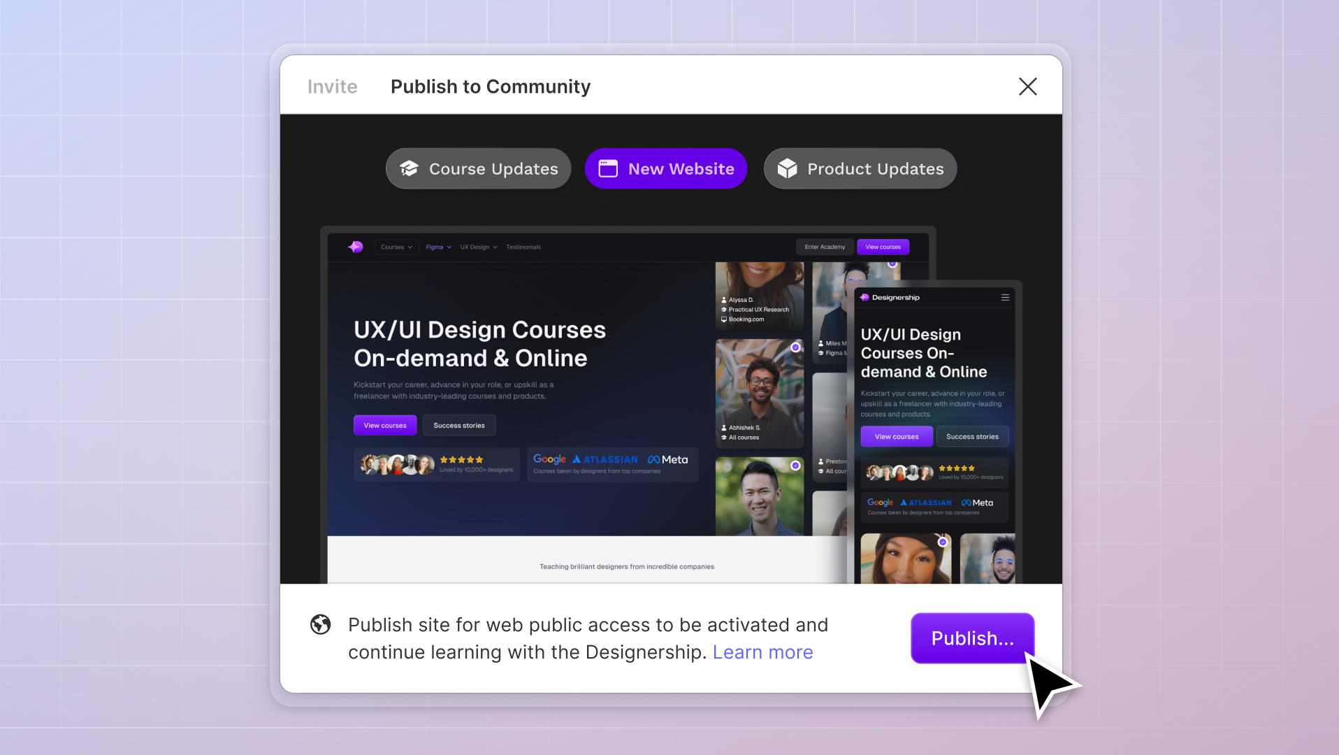
New website, course and product updates - April 2024
A lot happened this month. Take a look at what's coming.
Michael Wong
Apr 17, 2024
·
7 min read


Grid systems help UI designers organise elements consistently across different mediums including, mobile, tablet, and desktop.
In Figma, grid systems are called layout grids that come in different forms and sizes, which vary based on the interface you're designing for. In this article, we'll explore layout grids in Figma and guide you on creating responsive grids.
Layout grids are just one of the many functions you can explore within Figma. If you're interested in learning more about grid systems on Figma and how it works alongside other features, Designership's Ultimate Figma Masterclass Course covers the complete end-to-end process.

Layout grids act as guard rails to keep your content aligned.
In Figma, you can use layout grids on frames and components. These grids don't depend on the size of your canvas, so you can adjust them to fit your design needs. Whether you want a grid with equal-sized columns or a grid that adjusts to fit your content, Figma has options.
Choosing the proper grid layout for your design can achieve a balanced, visually pleasing result that matches your design goals and help create a more user-friendly product for your audience. This is also why it's crucial to understand the formats, types, and key elements of grid systems in Figma.

Figma allows you to choose which grid format to apply to your designs when applying layout grids. There are three grid format options, each with adjustable properties:
Grid with columns and grid with rows can be applied to a single frame. This maximizes the use of layout grids within your design. Using these grid formats together can give you more control and flexibility in aligning your design elements.
There are two types of layout grids in Figma: fixed and fluid. Each of these types can be used depending on your design needs.

In a fixed layout grid, your design elements are static. Whether the frame size or orientation changes, the grid's width and position remain the same.

Fluid layout grids, also called stretch or flexible, are dynamic grids that adjust to the size of a frame. Elements shift accordingly as the frame is resized, making the use of fluid layout grids more responsive.
When using a fluid layout grid, any size or orientation changes to the frame will automatically apply to the grid.
To better understand the functionality of layout grids in Figma, there are four key terms to get familiar with.

Columns are the most used elements when it comes to responsive grid layouts. These serve as your guides on aligning your design's contents. Sectioning your design within columns also ensures the clarity and readability of your design for your users.
The number of columns, referred to as counts in Figma, in a layout grid varies depending on your frame's interface to help balance out your design. You can have up to 12 columns in Figma, but it is highly recommended that designers use the 4-point grid system where defined sizes and spaces are divisible by 4.

Gutters are the spaces in between your columns or rows. These provide a clear structure for separating your design across an interface. Gutters also ensure consistent spacing between your elements. Using the appropriate gutter spacing within your grid design establishes a balance between your elements, allowing you to maintain a neater-looking design.

Margins are the spaces between the edge of the interface and the first column or row of elements. They create empty areas around your grid design, which helps prevent overcrowding. These spaces provide breathing room and make your design look more balanced and organized.
Now that you have a deeper understanding of a grid system let's look at how to create a responsive grid system in Figma.

Breakpoints are specific thresholds on the screen where the design layout changes. These points determine when your design will adjust based on the size of the interface. When you reach a breakpoint (usually defined by specific dimensions), elements in your design will automatically rearrange themselves to fit the interface.
Using breakpoints ensures your design looks good and functions well on different screen sizes. It allows your design to adapt and provide an optimal user experience, whether someone is viewing it on a small smartphone or a large desktop monitor.
Before applying a layout grid to a design, you'll need to identify your breakpoints first. These breakpoints indicate when your design layout will change as the screen resolution or screen size changes.

On most screens, the first breakpoint starts at 320px. This means that from 320px onwards, the interface layout adapts as the screen size increases. Anything below the breakpoint would be the point where the layout would stop adjusting.

As the interface expands, the layout changes and elements begin to section into different columns. The larger the screen's sizes are, the number of columns that appear on the interface increases, creating an evenly-spaced and balanced UI design.
In creating responsive designs, it is important to note that breakpoints may vary according to the website design, browser dimensions, and user's screen resolution. However, the most commonly used breakpoints include:
Once you've identified your design's breakpoints, it's time to create your Figma frames.

Using your identified breakpoints, head to Figma and create your frames. These frames represent the different devices that you will be designing for. Each frame would have different dimensions, with its width corresponding to your breakpoints.

In grid design, these frames are called viewports. To create them:

After creating your viewports, each would have different layout grid column counts to cater to the space you're designing for. As you increase your interface size, you also increase the column count. This ensures a balanced design as more elements are placed into the Viewport.
Apart from the column count, the layout grids' margins and gutter adjust as the interface expands. Following the 4-point grid system when identifying margin and gutter spacing is good practice, especially for creating layout grids for different displays.
In a 4-point grid system, any defined height or width must be divisible by 4 or in increments of 4. This includes line heights, paddings, margins, and gutters. Following this aligns your elements equally, as most of your content gets sectioned with an even number.


Once you've created the layout grid on the Frame, make your design elements responsive by following the steps below:

The screen size is expected to expand for this Viewport, increasing the interface's content. To balance out the content for this Viewport:

Generally, for Viewports with breakpoints above 768px, it is recommended to use a 3-column layout to be more precise with balancing out your design. Remember to follow the 4-point grid system and utilize column counts divisible by 4.
In this case, we'll use 12 columns for a 3-column content layout. To create an evenly-spaced layout grid for this Viewport:

Viewports higher than 1024px contain more content. The columns that structure the content go beyond 4 columns for an evenly-spaced design. Some designers with higher viewports utilize 5 columns to have a less-crowded design. For this example, we'll be using 4 columns.
In these Viewports, the margins and gutters of the interface also increase, creating more whitespace between elements placed on the design. As a result, margins and gutters typically double and are larger for better readability.
To balance out the content for this Viewport:
It is important to note that there are no strict guidelines on how your layout grids should work. You can use any measurements for your column count, margins, gutters, and other spaces if they fit your design requirements.
If you look at any web app or website, these designs will utilize varying types of Grid layouts. If your layout grids follow the 4-point grid system, you can create a balanced design regardless of Grid type and format.

When you've laid down your layout grid onto your design, Figma allows you to visualize the responsive grid system to how it would look from a user's perspective.
Using the Figma Plugin Breakpoint, you can easily preview your responsive layout according to your Viewports:


Now that you've learned how to create responsive layout grids in Figma, there are still several key principles to remember when applying a responsive grid system to your design project. One of those being that grid systems are not a one-size fits all idea.
Different user interface designs, from websites to mobile applications, could have different layout grids to cater to their content. To ensure coherence, clarity, and proportionality with your designs, utilizing the 4-point Grid System can guarantee the consistency of your designs no matter the layout grid Format.
Responsive layout grids are just one of the many things to learn about Figma. If you're looking to learn more concepts like component properties, prototyping, and more, then Designership's Ultimate Figma Masterclass Course will help you better understand how to approach them.
Helping over 6,000 designers worldwide, this Figma course gives a comprehensive step-by-step guide on the end-to-end design process from ideation to developer handover and design implementation. We guide you with practical solutions, expert advice, and hands-on projects so you can make the most out of Figma's most useful features.
Whether you're a beginner seeking to grasp the fundamentals or an experienced designer aiming to refine your skills, Designership's Ultimate Figma Masterclass Course is created to empower you every step of the way.
Mizko, also known as Michael Wong, brings a 14-year track record as a Founder, Educator, Investor, and Designer. His career evolved from lead designer to freelancer, and ultimately to the owner of a successful agency, generating over $10M in revenue from Product (UX/UI) Design, Web Design, and No-code Development. His leadership at the agency contributed to the strategy and design for over 50 high-growth startups, aiding them in raising a combined total of over $400M+ in venture capital.
Notable projects include: Autotrader (Acquired. by eBay), PhoneWagon (Acquired by CallRails), Spaceship ($1B in managed funds), Archistar ($15M+ raised) and many more.


.jpg)


%20(1)%20(1).jpg)