


What's New
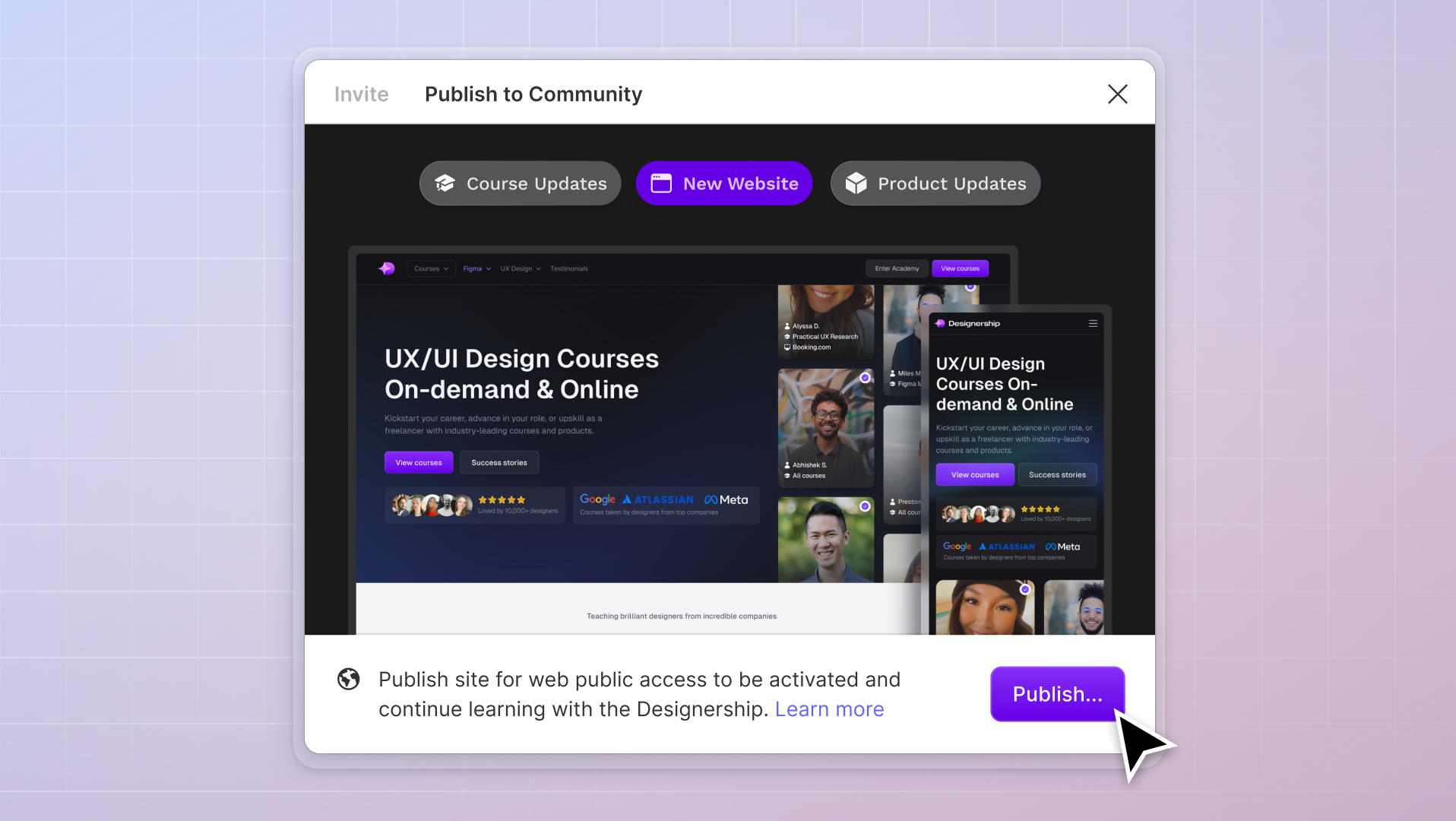
New website, course and product updates - April 2024
A lot happened this month. Take a look at what's coming.
Michael Wong
Apr 17, 2024
·
7 min read
.png)


If designing with Figma is like painting on the best quality canvas, then Figma UI kits and design systems are like getting access to the highest quality paints and brushes driven by AI. If that makes any sense.
Working as a UI designer is a lucrative career for anyone. After all, who wouldn’t want to work in a field with so many great career opportunities and a competitive salary? Best of all, with UX/UI design, you can work remotely, work abroad, and for yourself or a company.
If you’ve got a love for UI/UX design, then no doubt you’re using Figma. After all, it’s the most used design platform, it’s the easiest and most intuitive, and you can create incredible designs with ease.
But, if Figma is so great, why do we need Figma design systems or kits?
A UI kit and design system helps you to streamline your workflow, improve your designs, and enable you to create pretty much anything you want to.
They are there to help you save time designing by completing menial tasks for you, providing templates, and giving you components and variants that would otherwise take you hours.
UI kits and design systems are sometimes paid, with costs depending on the number of users or licenses. Otherwise, they are free through the Figma Community. Thanks to innovation in the design world, you can even learn how to build and structure your own design system from the ground up.
This is why Figma is so fantastic: it allows you to seamlessly and effortlessly bring in UI kits and design systems into your workflow. You’re not limited to the confines of just Figma's native features—you are instead being encouraged by this platform to explore, expand, and experience the magic of shared design.
We all know that design systems and UI kits help you speed up your design and production processes. However in most cases, it comes with a cost.
It restricts your ability to customize it with ease.
Here are the 2 most common issues with most design systems and UI kits.
Are there solutions on the design system and UI kit market that solve these problems? Most definitely, keep reading!

Are you fed up with recreating the exact details for every project, constantly setting up the same components to be responsive, or even just feeling a little disorganised across the board?
Shipfaster UI 2.0 is here to make your life even better as a UX/UI designer.
In this design system, you will get immediate access to:
Here's a video of it in action.
Shipfaster UI has been designed for scalability and efficiency in mind. It is one of the few design systems and UI kits that solves the 2 issues we've raised earlier on in this article.

As you can see with the above screenshot, our components are built to casecade down. This means that if you want to make any stylistic changes to your variants, you only need to make it once in the .Style components, and it will automatically apply it to all your variants. Yep! It's bloody efficient.

We have treated our design system like a set of legos. We have built all the individual building blocks for you, so you can go and build whatever you want. Without having to break away from instances. Maintaining integrity in the system and allowing you to scale your UI designs — super fast!
The design system is also part of the Designership’s ecosystem of products and courses to help designers excel. This includes the Ultimate Figma Masterclass—an immersive, interactive, super fun course in becoming a unicorn designer. Along with 40,000+ hours of free Figma lessons and content on The Designership’s YouTube channel and the dedicated Designership community, Figma has never been easier (or more fun!).
Stop wasting time and get right into the bones of what you want to create with Shipfaster UI.
Plus, with free lifetime updates, it just keeps getting better!

UI Prep is a Figma design system UI kit for Figma created by Jake Tsacudakis and Molly Hellmuth—both familiar faces in the UI design world.
This design kit has quickly gained popularity within the UI community for its back-to-basics approach to design. Renowned for being a “no-fluff” system, the UI Prep design system kit utilizes Figma’s key features, optimized auto layout, and variant components.
Their well-crafted UI kit includes over 100 styles, plenty of icons, and multiple layout examples to help you make your Figma design system flow effortlessly. A Figma-native product, the UI Prep design system automatically updates along with Figma (no more messy patches) and has a great Playground and Tips section for you to hone your Figma skills.
The team behind UI Prep is pretty on the ball in terms of updates. Their most recent updates include light and dark theme modes and improved file structure and organization. To the “Quick Start Guide,” they’ve also added some video tutorials and playgrounds.

Cabana is a Figma UI kit bursting with a wide selection of Figma templates, essential UI components, and handy design blocks that can help you create complex layouts with ease.
With Auto-layout 3 and their commitment to avoiding bloatware, Cabana is great for those who struggle with app crashes or lag.
Their pricing system starts at $58 for their standard package. However, if you’re looking for page examples, you’ll need to upgrade to their Premium package. Both packages come with a “no risk” 60-day money-back guarantee, so you can take it for a test drive and see if this design kit is right for you.

The Lo-fi Wireframing Kit is a free library housing over 100 wireframing components. The kit’s creator, David Whitely, had created several “standalone wireframing tools” before realizing that jumping between tools was time-consuming and frustrating. As such, he combined his already-amazing kit with Figma’s native platform to bring everything under one roof.
With over 100 components, including buttons, images, tabs, and text fields, this free library is updated frequently to ensure it runs smoothly. The kit also includes 200+ icons from Feather Icons suitable for commercial use.
While this kit is completely free, consider donating to the designer to help support the community (after all, it’s creators like yourself that help make the design a better space!).

Startup: $110 (2 users)
Agency: $156 (5 users)
Enterprise: $253 (unlimited users)Full PackageSolo: $123 (single user)
Team: $318 (unlimited users)
Inspired by the incredibly popular React UI library, Ant Design is a Figma UI kit created by Matt Wierzbicki. This kit is available for Figma-only use or as a complete all-in-one package along with a UX toolkit and other handy Figma design tools.
Ant Design Systems for Figma is touted as a “godsend for productivity” with a firm focus on stamping out miscommunications across teams with a well-organized library. The kit also offers all the good stuff, including a wide variety of components and styles, and components.
Pricing for Ant Design is pretty reasonable. However, some are hesitant about the cost of the design system, especially when scaling beyond a certain number of users.
Ant Design System is also available as an Adobe XD UI kit. They also have a free demo version available to download. Also, they’ve launched a nifty UX tool kit that is now compatible with Figjam and was recently the #2 trending product on Product Hunt.

The iOS 15 UI Kit for Figma is a brilliant resource that creator Joey Banks has shared with the community. A must-have for anyone working on, building, or looking for an iOS kit, this kit was designed to be an all-in-one.
Banks is incredible when it comes to updates and responding to community messages. The changelog alone is a testament to his commitment to sharing a close-to-perfect kit with fellow Figma-users.

The Pegasus Design System is a battle-tested Figma design system created to “help you design at scale.” This multi-purpose UI kit is used by several universities worldwide, including the one and only: Harvard University.
With more than 2,000 components, 100+ styles, and transport kit patterns, Pegasus is great for those looking to bring together development and design teams.
Along with their paid packages, you can also check out the lite version of this kit on the Figma Community. Although it doesn’t have the full capabilities of the paid version, it’s a great way to test it out without losing money. The one downside of the lite version is the lack of a smaller option for mobile as their pro currently has four sizes (updates reportedly coming soon).
The Pegasus team have also launched an Adobe XD version for those who haven’t yet made the switch to Figma.

FlowBite is a Figma UI kit created by Themesberg based on the very popular Tailwind CSS framework.
Best used when working with Tailwind, Flowbite is still a pretty powerful addition to any design workflow. This is due to its 28 responsive page examples and a very active support team waiting to answer any questions.
Flowbite is a very popular choice for SaaS developers and designers. This open-source library has over 400+ web components and interactive elements to play with. The price point for Flowbite is incredibly high for solo designers, but thankfully there’s a free demo version available in the Figma community.

The Figma Material Design 2 UI Kit has a free version and a paid pro version. Starter Kit has been designed to help you effortlessly create and design Android apps and high-fidelity prototypes. This impressive kit comes with 150+ components, 25+ layouts, and five example apps and flows to get you in the groove.
Their free kit includes over 130 Material UI Elements, a sample app prototype, sleek auto-layout and variants, and a team library ready to go. If you do want more bang for your buck, their Pro version includes 350 advanced components and a lifetime of free updates (not bad!).

Hello, Layers! This accessibility-first design system is a Figma UI kit and design system bursting with 350+ components, example products, and blocks.
Layers biggest selling point is their All-Access Pass—an annual subscription that gives you access to all of their other products. While there is only one additional product at the moment called Flow, it’s a handy bundle to have. Plus, Flow is a great tool to have in your back pocket, helping you to annotate and craft all kinds of flowcharts in Figma.
Unfortunately, they don’t offer a free trial or a demo, but they do offer preview pages of the kit in action on their website.

Simplekits is just that: a simple Figma UI kit that is simple and easy to use.
The vision behind this kit was to offer a more minimalistic, streamlined approach to kits. This adaptable Figma design system offers a pre-built design system, a small collection of typography and color styles, and many components to customize.
Ideal for laying a solid foundation of core components for any project, Simplekits also offers a free Figma community demo version.

Tetrisly is a UI starter kit that helps you create a design system’s UI library for Figma.
A lighter UI kit, this handy tool has been crafted to serve as a starting point for your larger Figma design systems. This kit comes with 2,500+ components, 700+ attractive icons, and currently 55 predefined styles.
For those who are still working on Sketch rather than Figma, Tetrisly also offers a kit for Sketch. You can also nab a demo UI kit via their website.

Who doesn’t love a free kit, especially when that kit is as good as the Nucleus UI iOS UI Kit?
A 100% free mobile app, the Nucleus UI iOS UI kit allows you to create mobile app prototypes or mockups with ease. Designed by Thomas Budiman, Juinal William, and Salmun Barnabas, this kit is based on “iOS Human Interface Guidelines.” Along with over 300 components across 50 categories, they also have a handy little shop where they sell pre-crafted kits.
Nucleus is free for Figma, and for Sketch and Adobe XD it costs as little as a cup of coffee.

Would you like some education with your UI kit? The Online Learning UI SINAU UI Kit is ideal for you. This basic kit operates as a kind of online learning tool, where you can pick up the basics of UI and design as you go.
If you’re someone who is learning UX/UI design through a paid course, a free course, or learning as you go, the SINAU is great to have as extra practice.

Designed as a way to combat clunky, messy kits that don’t work on scale, Untitled UI is great for larger teams and startups.
This jam-packed kit comes with over 10,000 Figma UI components and variants, close to 1,000 icons and logos, and a smart, scalable typography system.
There is a free demo version available, but if you want more than 2,000+ components and variables, you’ll need to splash some cash on the $99 pro version.

Designed for “everyone who designs,” the Stratum Figma UI kit is a short and sweet (and handy) tool. Created by Denis Danilov, this kit contains almost 10,000 Figma components and variants.
The biggest selling point for this kit is the usability, flexibility, and freedom to lay some good foundational work. The kit comes with a “no-questions-asked money-back promise”—great for test-driving its capabilities.

Taking full advantage of Figma’s incredible Auto Layout features, Module UI Kit is a wonderfully simple helping hand for Figma. Known for their regular updates and tweaks, Module is quickly catching the eye of designers around the world.
This kit has one of the more impressive global style systems and also offers a consistent spacing system based on a 4px baseline grid (pretty nifty!).
You can access a free preview Figma file or, if you’re a student or teacher, get a nice discount code to use on top of your full-price package.

Touted as being the world’s largest Figma design system, The Design Encyclopedia allows you to browse the kit before you buy. This gigantic Figma library was created by Product Designer Jon Moore who runs a small YouTube design channel.
This encyclopedia kit has thousands of UI components, styles, and page templates to explore. However, the best part of the kit is the focus on charts and interaction patterns.
This kit is a little pricier than others, so be sure to check out the free preview first before buying.

Did you know that Uber’s design team created and shared a design system in the Figma community called Base Gallery? You do now!
According to Uber’s design system engineering manager Gergely Nemeth, the design system was created to act as a “base” for other design systems to build on top of.
“These new design systems,” he says, “are just a thin theming layer on top of Base.”
This incredible free Figma design system is renowned for its impressive Figma component library and the React implementation. The system is still relatively new, less than a year old, but having a powerhouse company like Uber behind it will no doubt help to smooth out any kinks in the system.

Venus Design System is a Figma UI kit created by Simmmple. Their landing page is bursting with emojis and cute images, but don’t be fooled—this fully responsive design system is incredibly powerful. Along with the paid packages, they offer a free Figma preview.
You can expect to accelerate your designing workflow pretty effortlessly based on Atomic Design Methodology. Along with 2,000+ of the most-used UI/UX components, you also get access to 1,400+ of Google’s Material Design. They have a few features coming soon, such as a specific library based on React, so keep an eye out for updates.

A kit designed to give you less mess and more flexibility, 73px brings you the fundamentals of design rather than a “component dump.” Źmicier Aqua and Jordan Banafsheha have crafted this multi-purpose Figma UI kit and design system—both incredible designers with impressive resumes to boot.
Said to be a lifesaver for product managers, 73px is designed as a sort of “wireframe kit” so you can instantly wireframe design products without starting at zero. The kit does come with all the expected (and valuable) components and layers, styles, and typography.
There are no free demos for this one, but you can preview the UI kit for free. Again, if you’re a student or teacher, you can enjoy 50% off by contacting them via email.

Cutframe is a convenient open-source mobile wireframe kit you can use for designing and prototyping your ideas.
Described as a “wireframe kit for product-enthusiasts,” CutFrame comes with 250+ components, 200+ screens, and 170+ icons for mobile devices.

The ever-loved Airtable Apps UI Kit lets you design your very own app with the same UI kit the Airtable team uses internally. You can build your own custom apps on top of Airtable using Custom Apps and the Blocks SDK.
Airtable has a pretty extensive marketplace of apps to choose from. They offer a free tier to use Airtable (up to five users).
The free tier, however, only allows for one app. Their Plus ($10/month) and Pro ($20/month) allow for three and ten apps per base, respectively.

Not technically a standalone UI kit, The Goldman Sachs Library actually consists of four stellar kits: Patterns and Layouts, Grids, Components, and Foundation.
These design systems and UI kits from Goldman Sachs allow teams to create client-centric digital products. The Patterns and Layouts kit is a must-have. The ready-to-use responsive layout examples are built using mobile-first principles for some of the most commonly created page types at Goldman Sachs.

Another collection of goodies. The Shopify Design system is a must-have for anyone working in e-commerce, commerce, or small businesses.
Figma is Shopify’s default tool for product design and prototyping, so their Figma Onboarding prototype file is perfect for anyone new to “Figma, or Shopify, and wants to get up-to-speed quickly.”

This kit is perfect for improving communication for those working in Microsoft Teams. Microsoft Teams UI Kit comes with all the core components, fundamental design concepts, and scenario-based templates you could need for designing Teams apps.

With 10+ million daily active users, the chances are that your workplace will be using Slack. Slack Block Kit for Modals lets you design and build your Slack apps.
In case you didn’t know, Block Kit is a UI framework for Slack apps—ever seen a message in Slack that has buttons or a select menu? That’s Block Kit. On the other hand, Modals are more like a popup in that they grab a user’s attention, prompting them for some kind of information or input.

GitHub’s design system Primer is everything you need for designing GitHub interfaces.
Primer was created for GitHub by GitHub. The design system was eventually released to open-source it to allow the community to design and build their projects with Primer.

Created by Kiwi.com, the Orbit Design System is a complete library of desktop website components. The design system comes with over 30 high-quality components for your web projects and desktop variants. They also have a Responsive set for mobile variants available.

Piqo Design is renowned for its brilliant library of designs. Not just a cute name, the Shiba Onboarding UI kit by Piqo Design is robust, well-made, and free through the Figma community.
The onboarding kit comes with a tonne of onboarding screens, including those with Illustrations, phone mockups, and more. Best of all, you can customize every detail to suit your required aesthetic, including text styles, color styles, and fonts.
With an infinite library of brilliant kits and systems at our fingertips, we hope this summary helps you find the perfect design system for you. After all, every designer is at a different point in their journey with unique skills! If you want to level up your skills a little more, our Ultimate Figma Masterclass and Shipfaster UI Figma Design System is always waiting for you.
Having so many unique kits and design systems speaks to how wonderful Figma is and its community. With such a dedicated global community working together to create tools to help everyone design better, what’s not to love?
Mizko, also known as Michael Wong, brings a 14-year track record as a Founder, Educator, Investor, and Designer. His career evolved from lead designer to freelancer, and ultimately to the owner of a successful agency, generating over $10M in revenue from Product (UX/UI) Design, Web Design, and No-code Development. His leadership at the agency contributed to the strategy and design for over 50 high-growth startups, aiding them in raising a combined total of over $400M+ in venture capital.
Notable projects include: Autotrader (Acquired. by eBay), PhoneWagon (Acquired by CallRails), Spaceship ($1B in managed funds), Archistar ($15M+ raised) and many more.


.jpg)


%20(1)%20(1).jpg)