


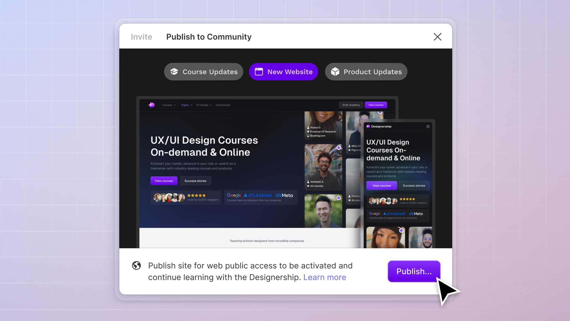
What's New
New website, course and product updates - April 2024
A lot happened this month. Take a look at what's coming.
Michael Wong
Apr 17, 2024
·
7 min read


UI kits and Design Systems are essential in ensuring consistency throughout projects. Many design projects utilize UI kits and Design Systems to streamline work towards a more cohesive design, ultimately increasing team productivity. Because of this, designers choose to build their own or use existing UI kits and Design Systems.

UI kits and Design Systems are two related concepts in the UI design world. While both improve a designer's process, their usage and content can differ.
UI kits are pre-designed collections of user interface elements, such as buttons and navigation menus, that enable designers to create website or application interfaces quickly and efficiently. These kits maintain design consistency while also allowing customization of the UI elements.
On the other hand, design systems extend beyond visual elements and encompass guidelines and detailed processes for consistent product design. In addition to UI components, design systems provide principles, documentation, guidelines and style guides for designing and building websites or applications.
UI kits and design systems work together to achieve consistent and efficient design outcomes. While UI kits save designers time and effort by ensuring consistent designs across projects, design systems offer guidelines, principles, and processes for creating cohesive interfaces.

Figma provides designers with plugins to extend the functionality of UI kits and Design Systems. These plugins make it easier for designers, from web designers to app designers, to organize their Figma UI kits and Design Systems, document their Figma Design Systems, and work with their team or developers to keep the design consistent.
With over 1,000 plugins available to date, choosing the most effective Figma plugins for UX designers can be challenging. In this article, we will present eight of the best Figma plugins to use with your UI kits and design systems.

Design tokens in Figma are small units of information that describe the appearance of design elements. They contain details such as colors, fonts, and spacing, serving as a reference guide for how each element should look in a user interface.
If you manually adjust each design element and label each adjustment for developer handover, you're likely slowing down your workflow. To speed things up for you, using Tokens Studio with your UI kit and Design System is the way to go.
Tokens Studio is a Figma design token plugin that offers an extended ability to adjust your tokens in simple clicks quickly. Color styles and typographies are often easily customizable with component properties, but Figma doesn't allow that feature for other tokens, such as spacing - this is where Token Studio thrives.

Instead of manually selecting your designs one by one and selecting which 4px-increment spacing to use, Token Studios lets you adjust spaces with just a click. The plugin features a convenient pop-up window that stores newly created tokens, referencing your existing ones.
ThisThe tokens you create within Tokens Studio allow you to create a style guide for your project, which developers can reference. You can also generate sets of tokens that deviate in color or style to create themes like dark or light modes.
Nevertheless, it remains a handy plugin, although some of its features may require a more in-depth knowledge of coding for design, making it typically recommended for advanced UX designers.
As of 22 June 2023, Figma released a major update with the launch of Variables. Variables can now help manage Tokens within a project. Learn more here!

UI kits and Design Systems are often duplicated across multiple projects by designers, enabling them to quickly create designs without starting from scratch with essential elements. When doing so, one common task is to update the font and color styles according to the new brand for the project.
However, manually selecting and changing each text and color style can be tedious and time-consuming. Which is why Batch Styler is the perfect plugin for tasks like these.
Batch Styler allows designers to customize multiple text and color styles quickly within seconds. Whether a client prefers a different font or has recently purchased a new one, Batch Styler simplifies formatting the entire design. By automatically detecting existing text and color styles, you can choose which ones to customize, streamlining your workflow efficiently.

To use Batch Styler, open the plugin in Figma and follow these steps:
Batch Styler is a helpful plugin that allows you to swiftly change your text and color styles in bulk, making your UI kits and Design Systems work for you in multiple projects.

Zeplin is a Figma plugin that organizes design elements into a centralized library, offering an overview of buttons, text styles, color guides, and more.
Once your design is polished and ready to be handed over to your developer, you might create a style guide from scratch or insert annotations within your project to let your developer know where and how to use specific visual Figma components of your design. It's a difficult task, especially if you're building a massive project with multiple platforms, themes, and versions included.
With Zeplin, handing over polished designs to developers becomes streamlined. It exports project frames from Figma to the Zeplin platform, enabling designers and developers to manage and collaborate on project content efficiently. Developers can easily access information about component placement, code snippets, usage, properties, and more within Zeplin's platform.

Additionally, Zeplin provides an organized view of the style guide, including properties like size, type, and state. It acts as a bridge between designers and developers, ensuring a smooth handover without requiring deep coding knowledge from designers or designer training for developers.

Designers, whether web designers or app designers, come across a LOT of components with multiple variants as they create their projects - especially when they create or have a UI kit and Design System. Designers often encounter disorganized variants as they create their projects and develop new variations.
But imagine the extra task of organizing your variants within your components. You could have quickly been moving on to your next design project or other more productive processes, but instead, you'd be spending a handful of your time sorting variants.
That's why many designers have been using the Simple Sort plugin for years.
As the name implies, Simple Sort is pretty straightforward. It automatically organizes and structures all your variants which you can easily adjust based on how you like them.
So let's say your button variants are all over the place. Primary buttons are aligned with the secondary ones, and large buttons are placed with the small outlined buttons, etc. This can confuse other designers of your team referring to your UI kit and Design System and developers that will be bringing your design to life. Simple Sort helps you avoid confusion.

Upon opening the plugin, it quickly sorts the variants of your selected component based on their size, type, and state attributes. Apart from reordering your variants, you can also adjust how you view them, whether by row or column. It's a neat trick that keeps your Figma Design System sleek, clean, and ready to be utilized.

Creating a UI kit and Design System is meant to be a style guide for mainly a designer, their team, and even its developers. Documentation is crucial in building these resources, capturing information about specific components, their usage, properties, and more. However, manual documentation can be time-consuming, requiring designers to note and measure each element.
To help bypass the time you'd take to note and click every single measurement of your project, Measure was created.

With just a click, this Figma plugin allows designers to easily measure sizes, add redlines for precise measurements, and even measure distances between elements on the canvas. Measure simplifies the creation of redlines and tooltips, ensuring quicker and more efficient documentation and ultimately enhancing productivity.

When it comes to ensuring the quality and accuracy of your UI kit, Design System, or design project, manually checking each element and component can be overwhelming for any designer. However, Figma offers helpful plugins like Design Lint to simplify this process.
Design Lint is a powerful Figma plugin designed to detect and fix errors within your canvas automatically. By running the plugin, it identifies various types of errors, such as missing styles and incorrect border radius, providing you with a categorized and filterable list of issues.
In addition to its category view, Design Lint offers a convenient Layers View, allowing you to pinpoint the exact location of errors within your design. It even supports error detection for designs with a large number of layers, ensuring thorough error spotting.

It's pretty easy to use Design Lint in Figma. To utilize the power of this correcting tool, follow these steps:
Design Lint provides an 'Ignore' and 'Ignore All' for unique or intentional design choices, allowing you to dismiss errors that align with your intended design. Additionally, the 'Lock layer' feature in Figma enables you to exclude specific illustrations from the error review process.
Design Lint is a valuable tool for quality control in the design process, ensuring a more polished, error-free final design. By running Design Lint before handing over your project, you can significantly reduce the time spent on revisions and corrections while enhancing your overall design credibility.

Like Design Lint, Style Organizer is another plugin in Figma that is crucial in preparing your project for handover.
Suppose you've experienced noticing color styles or text styles that seem to look off from your overall design and have to double-check everything you've done repeatedly. In that case, you might be growing frustrated with your process already. Style Organizer helps you with this problem.

Style Organizer quickly assesses all the color and text styles used across your components and their associated style names within your project. This plugin ensures you haven't overlooked linking any styles to their global counterparts, preventing random and unlinked styles throughout your design.
Style Organizer provides a comprehensive overview of your style usage and allows you to identify any discrepancies or missed connections. Running this plugin right before handing over your project will save you time and effort, giving you peace of mind and confidence in the integrity of your design.

As a UX designer, one of the most important aspects to consider is the accessibility of your designs. Within the design industry, colors play a crucial role in determining the accessibility of a web or app design. The contrast ratios between colors significantly impact how well your designs comply with the Web Content Accessibility Guidelines (WCAG).
If you've completed your design and going through your project, it's difficult and time-consuming to continuously reference the WCAG to verify the contrast ratios of your colors. That's where Contrast, a powerful Figma plugin, comes in.

When you run this plugin, Contrast automatically finds any contrast issues with your elements. This plugin will identify whether your colors pass the standard of accessibility for design. It quickly alerts you to potential accessibility concerns and allows you to make informed adjustments.
With this plugin, you can confidently create designs that prioritize inclusivity and provide an optimal user experience for all.
The solution to all your weary repetitive tasks when designing is in front of you in just a few clicks.
If you're troubled with constructing a UI kit and Design System from scratch, we have you covered. Powering over 3,000 designers worldwide, Shipfaster UI 2.0 eliminates the tedious task of creating a UI kit and Design System from scratch. Say hello to organized, efficient, and exceptional designs.
In this Figma design system, you'll get immediate access to the following:
Shipfaster UI 2.0 is also part of the Designership’s ecosystem of products and courses to help designers excel.
Whatever type of designer you are, a web designer, an app designer, or even a product designer - if you're hungry for knowledge and want to leverage this design system, you can quickly learn to supercharge its capabilities through Designership's Ultimate Figma Masterclass. In this masterclass, learn to use Figma the easiest way possible and solve all hurdles you encounter as a designer.
And once you've got all the bases covered, efficiently utilize Shipfaster UI 2.0 and witness just how powerful this Figma design system is in mere clicks.
P.S. - we're constantly evolving and improving; expect a lifetime's worth of free updates with this design system.
Mizko, also known as Michael Wong, brings a 14-year track record as a Founder, Educator, Investor, and Designer. His career evolved from lead designer to freelancer, and ultimately to the owner of a successful agency, generating over $10M in revenue from Product (UX/UI) Design, Web Design, and No-code Development. His leadership at the agency contributed to the strategy and design for over 50 high-growth startups, aiding them in raising a combined total of over $400M+ in venture capital.
Notable projects include: Autotrader (Acquired. by eBay), PhoneWagon (Acquired by CallRails), Spaceship ($1B in managed funds), Archistar ($15M+ raised) and many more.


.jpg)


