


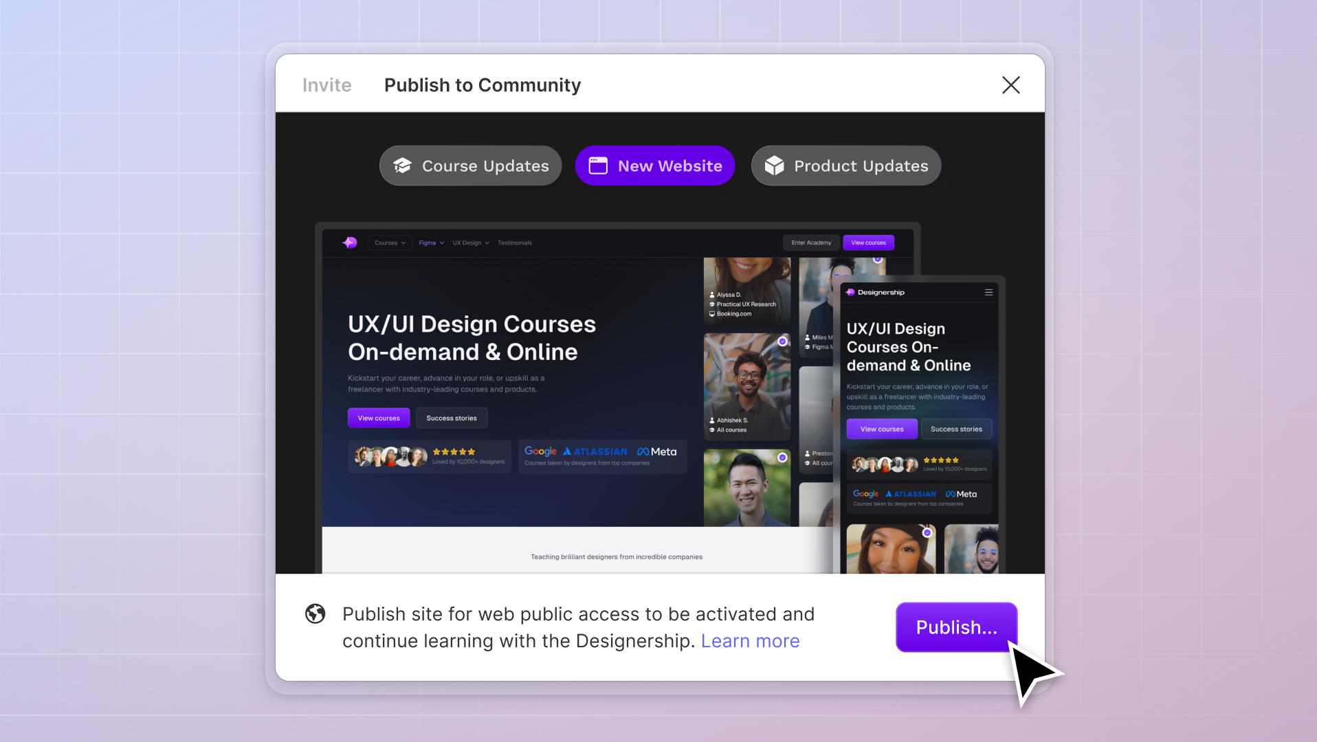
What's New
New website, course and product updates - April 2024
A lot happened this month. Take a look at what's coming.
Michael Wong
Apr 17, 2024
·
7 min read


There are over 1,000 new apps created every day. But the market is hungry for more. In 2020, over 592 million apps were downloaded on a daily basis. Plus, the average American spends more time on their phone than they do watching television.
Those stats are astounding and prove that apps are now part of our daily lives.
Apps are amazing… when done correctly.
The problem is that most mobile apps suck.
They’re confusing, redundant, annoying, and a waste of time.
This is why most apps get deleted within seven days of being downloaded.
Will your app suffer the same fate?
In this post, we’ll cover the best practices for developing mobile apps from a UX perspective. These are the practices that most designers obviously aren’t employing, but if you do, you’ll achieve the ever-illusive app stickiness.
Want to create the best mobile UX design ever? Keep reading.
Consistency is the most important element to creating a user-friendly design. Once you introduce an element to your user, they begin to associate it with a specific action. The last thing you want to do is switch up those colors, calls to action, or controls, because it confuses the user. Choose specific jobs for each design element and keep them the same throughout your app.
You should also be consistent between your mobile experience and your website, if the user is meant to experience both.
If given the choice between impressive and easy, your user will always prefer easy. Don’t try to wow the user with fancy design. Instead, focus on creating an experience that’s easy to use.

Most likely, your user will have some experience with using mobile apps. Instead of trying to teach your user how to operate a completely new app, rely on the familiar. Incorporate similar design experiences in your app so your user already knows what to expect.
Instead of inventing completely new experiences, look for ways to streamline common workflows.

Predictability is good in mobile UX design. It goes hand in hand with intuitiveness. If your user can predict what will happen as a result of an action, they’ll become more confident and comfortable while using your app.
Can apps truly be intuitive? Not really. None of us are born with the innate ability to upload TikToks or post snarky messages on Twitter.
However, you can make an app feel intuitive by reducing how much you ask the user to think. If the user simply “gets” your app because it makes sense, it will feel intuitive.

You’re working with a small screen. Your text shouldn’t be small as well. Make your text larger to ensure readability.
Are you asking the user to input the same information over and over again? Why not store that information and then autocomplete it when needed? This reduces the strain that you put on your user so that they only need to add new information as required.
Don’t wait until the user gets to the end of the form before you notify them of an error. Instead, mark incorrect or incomplete values immediately so that your user knows exactly what you need from them.
Cognitive overload happens when we’re asked to do too much. You’ll reduce cognitive overload and improve usability by reducing clutter. Get rid of any element (including content) in your app that doesn’t bring immediate value to your user.

Instead of asking your user to do too many things at once, create a step by step workflow. This way, the user is only required to do one task at a time. This makes it easier for your user to navigate your mobile app, and to follow through on the desired course of action.
The keyboard should always match the required text.
For example, if you’re asking the user to input numbers, the keyboard should magically change to a numeric keyboard.
Sprinkle helpful tips throughout the app for guidance, especially at potentially-confusing areas. If you know the user is likely to get hung up at a step, include a helpful note. Not sure where users may get confused? Check out your most frequently asked questions and support tickets to spot trouble areas.
Design with the human thumb in mind. While some use their index finger, the size of your controls should accommodate the average thumb. Design controls with large touch areas, at least 10 mm in size.
Designing for mobile devices is no longer optional. Use the above tips to create a satisfying user experience online as well as over mobile devices.
Mizko, also known as Michael Wong, brings a 14-year track record as a Founder, Educator, Investor, and Designer. His career evolved from lead designer to freelancer, and ultimately to the owner of a successful agency, generating over $10M in revenue from Product (UX/UI) Design, Web Design, and No-code Development. His leadership at the agency contributed to the strategy and design for over 50 high-growth startups, aiding them in raising a combined total of over $400M+ in venture capital.
Notable projects include: Autotrader (Acquired. by eBay), PhoneWagon (Acquired by CallRails), Spaceship ($1B in managed funds), Archistar ($15M+ raised) and many more.


.jpg)


%20(1)%20(1).jpg)