


Figma Components are reusable elements that designers can consistently use across various projects. It plays a vital role in providing a cohesive visual design language throughout a design. However, even with how beneficial components are, designers still encounter a common challenge when working with components: effectively and efficiently managing and modifying the different variations of those components.
This happens when designers make specific changes to component instances or create new iterations of variations within a component set, resulting in a time-consuming workflow and a cluttered and disorganized library. But Figma has a solution to this problem - Component Properties.
In this article, we'll dive deep into Figma's Component Properties and explore the various types of Component Properties and valuable tips and tricks for using the powerful feature.
Download our sample components here to follow along with the examples!
What are Component Properties?
Before Figma's Component Properties existed, designers manually selected and customized individual layers within a component set. For example, if they wanted to modify a button's icon, text, or color, they had to locate and edit each element separately, resulting in a time-consuming process.
Figma's Component Properties eliminate the need for all the unnecessary clicking, dragging, and editing. As Figma defines it, Component Properties are the "changeable aspects of a component." They allow you to change specific parts of your components in a central location and as you desire, which include:
- Component elements (color, text, shapes, etc.)
- Component Variants (Primary button - blue, Primary button - white, etc.)
- Component layout (arrangement of the elements within the component)
With Component Properties, you no longer have to dive into each element individually to make changes. Instead, Figma conveniently provides a right sidebar where you can view, select, and customize the available property options.
How to create a Component Property
Instead of manually customizing elements within each component by repeatedly double-clicking them, you have the option to assign properties to elements like text, icons, or colors. This efficient approach allows for seamless updates to the content of your components. For example:
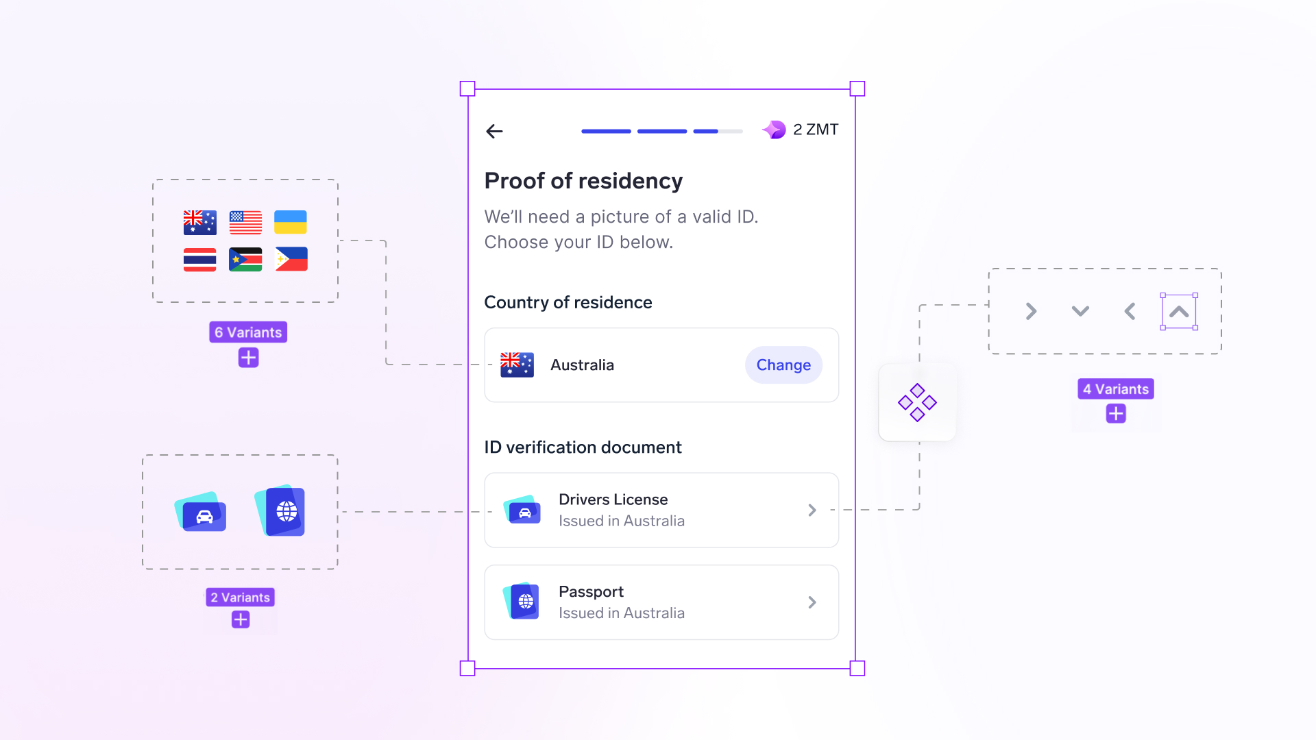
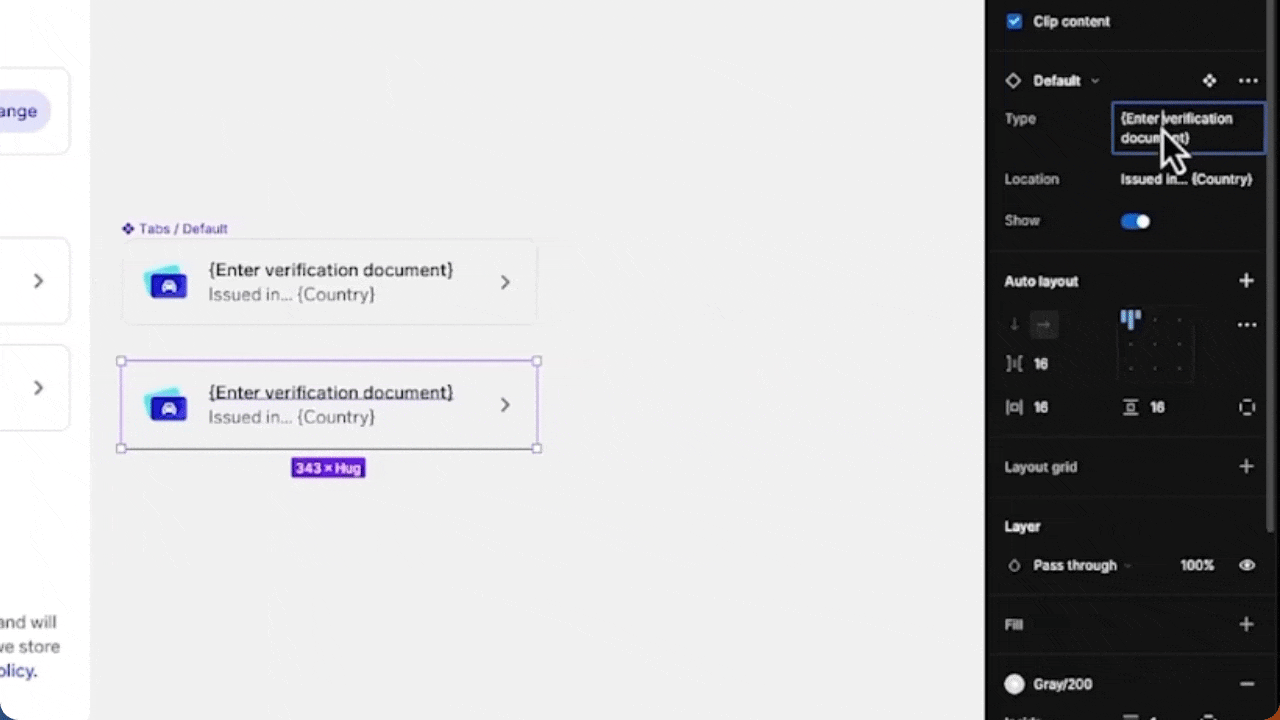
Suppose we're making a design that requires the input of an ID verification document. We initially create a component with the following elements:
- Text for document type
- Text for document details
- Icon for the document
- A chevron for the component
Instead of constantly changing the contents of the elements mentioned above, we use Component Properties in Figma to easily customize its contents by doing the following:
- Select the element you wish to 'easily edit with Component Properties'.
- Select the component property icon under the Content section on the right panel in Figma.
- Create your Component Property by providing the property name and property value (Example provided below).
- The Property Name: Type of Verification Document
- Default Value: {Enter Verification Document}
- Click 'Create Property'.
- Repeat the process for other elements of the component.
- Once all properties have been created, open your Components Library [Shift + I] and use an instance of your component.
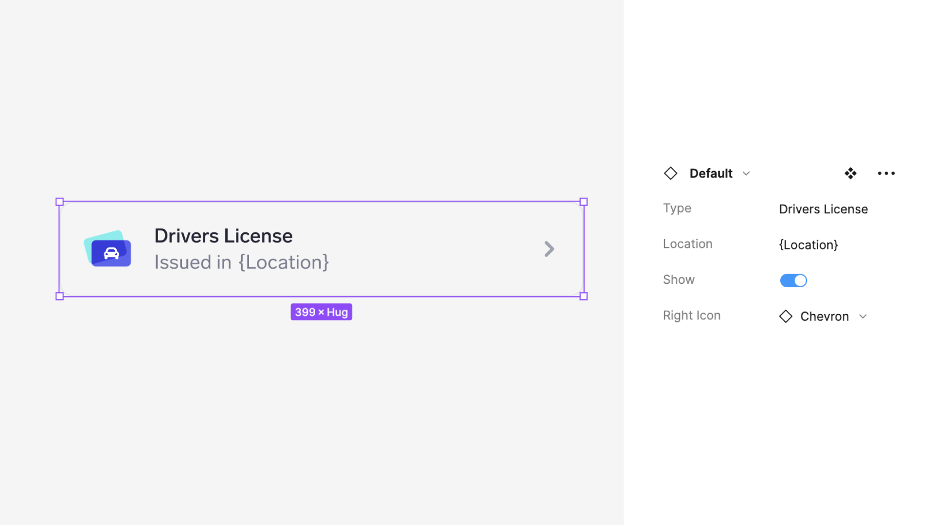
Notice that in this component, a section appears on the right panel in Figma, which shows the customizable elements of the component. You can easily make necessary changes without the hassle of searching for individual layers with Component Properties!
But this is just one kind of Component Property. Let's discuss more!
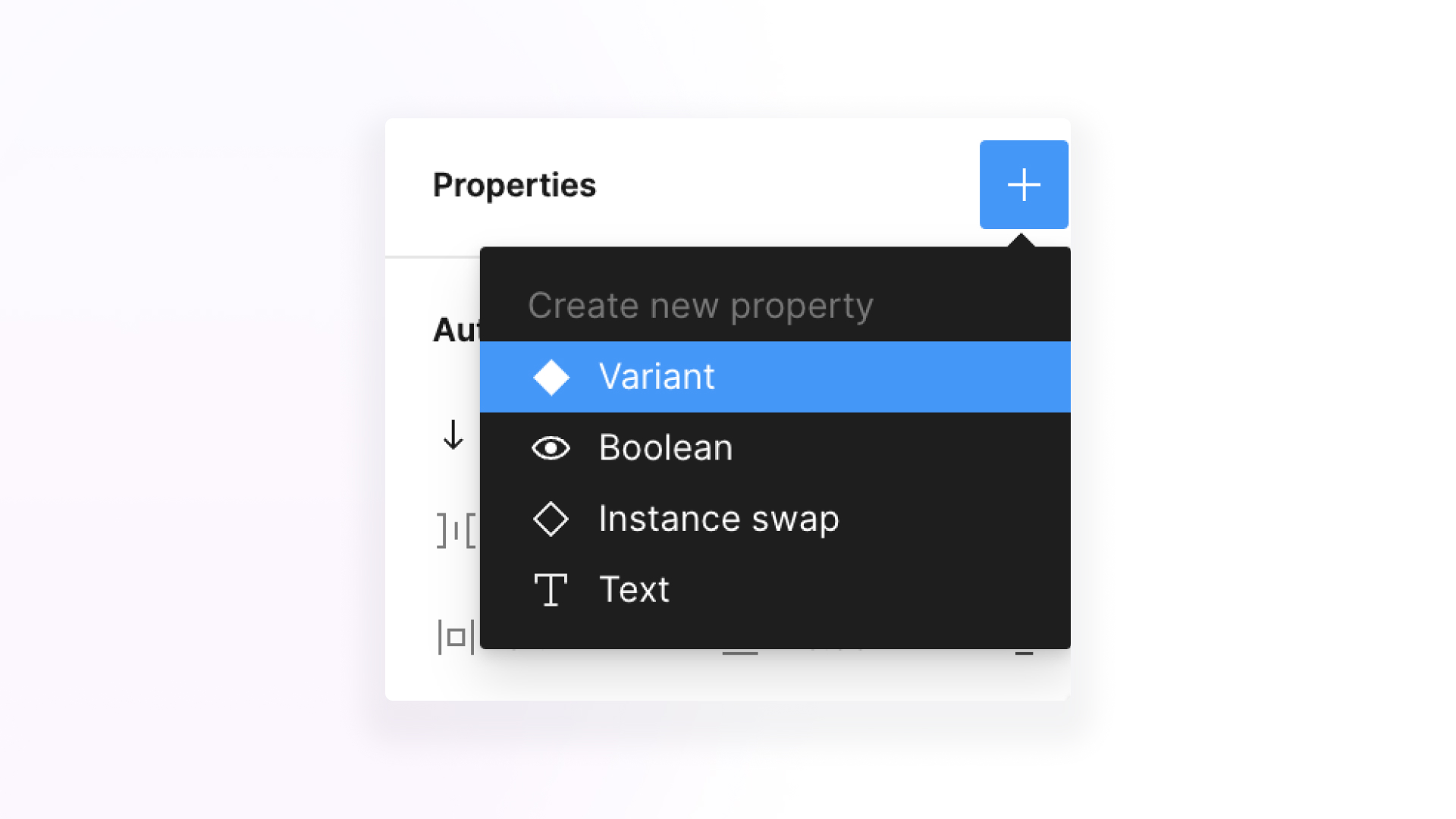
What are the different types of Component Properties in Figma?
There are four main types of Component Properties in Figma:
- Boolean Property
- Text Property
- Instance Swap Property
- Variant Property
We'll discuss each property to help you understand how Component Properties work.
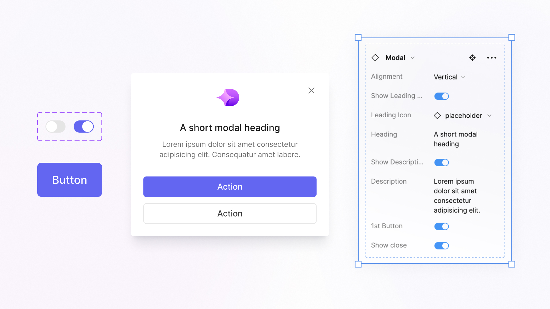
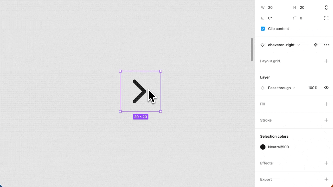
Boolean property
In code or computing, Boolean is a logic that means a result can only have one of two possible values: true or false, similar to how we deal with it in Figma.
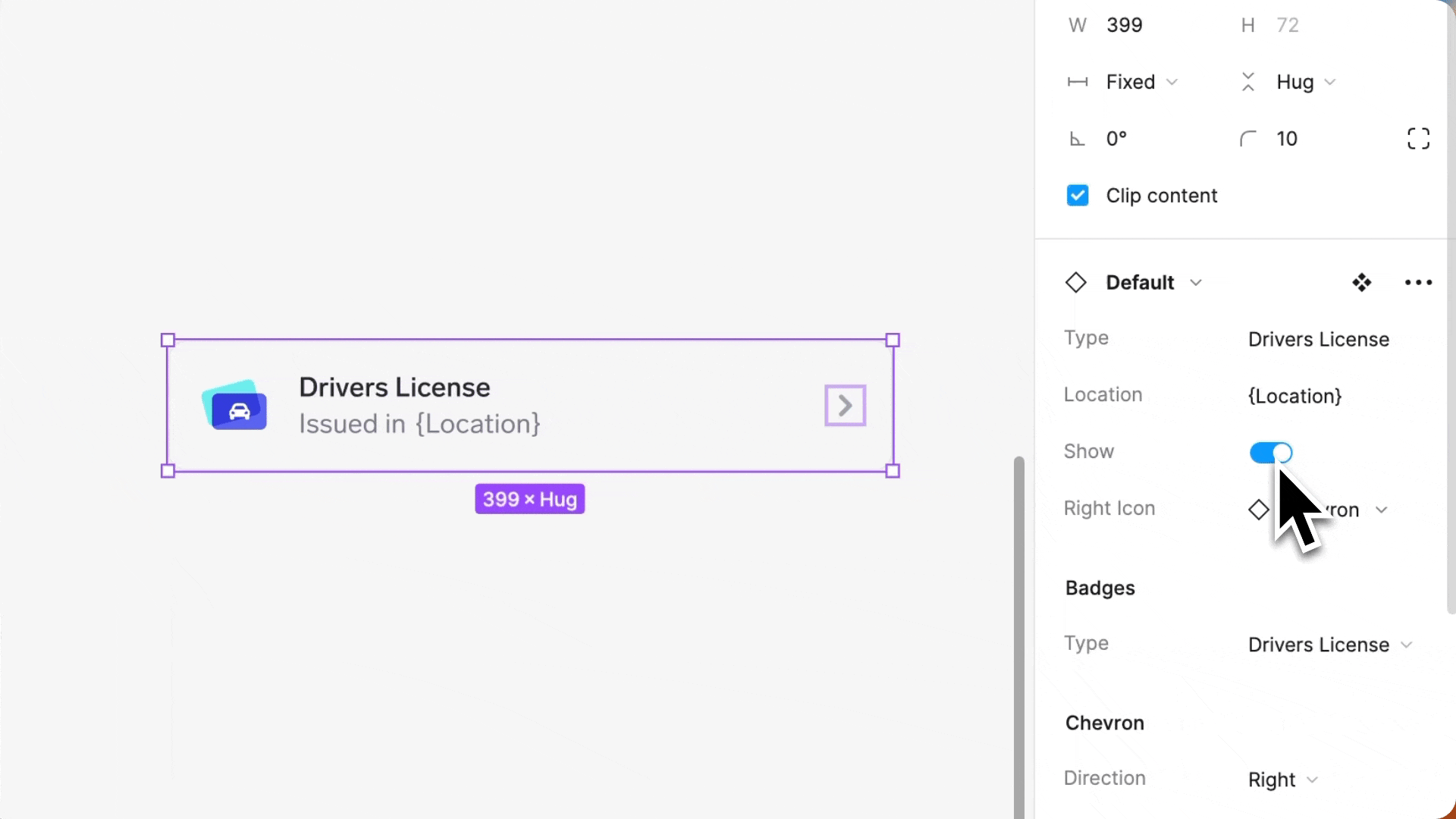
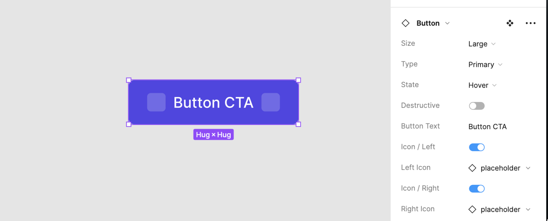
In Figma, the Boolean property asks you to set a True or False value for a specific layer in your component. This determines whether a layer is visible on your component and is displayed through a toggle button.
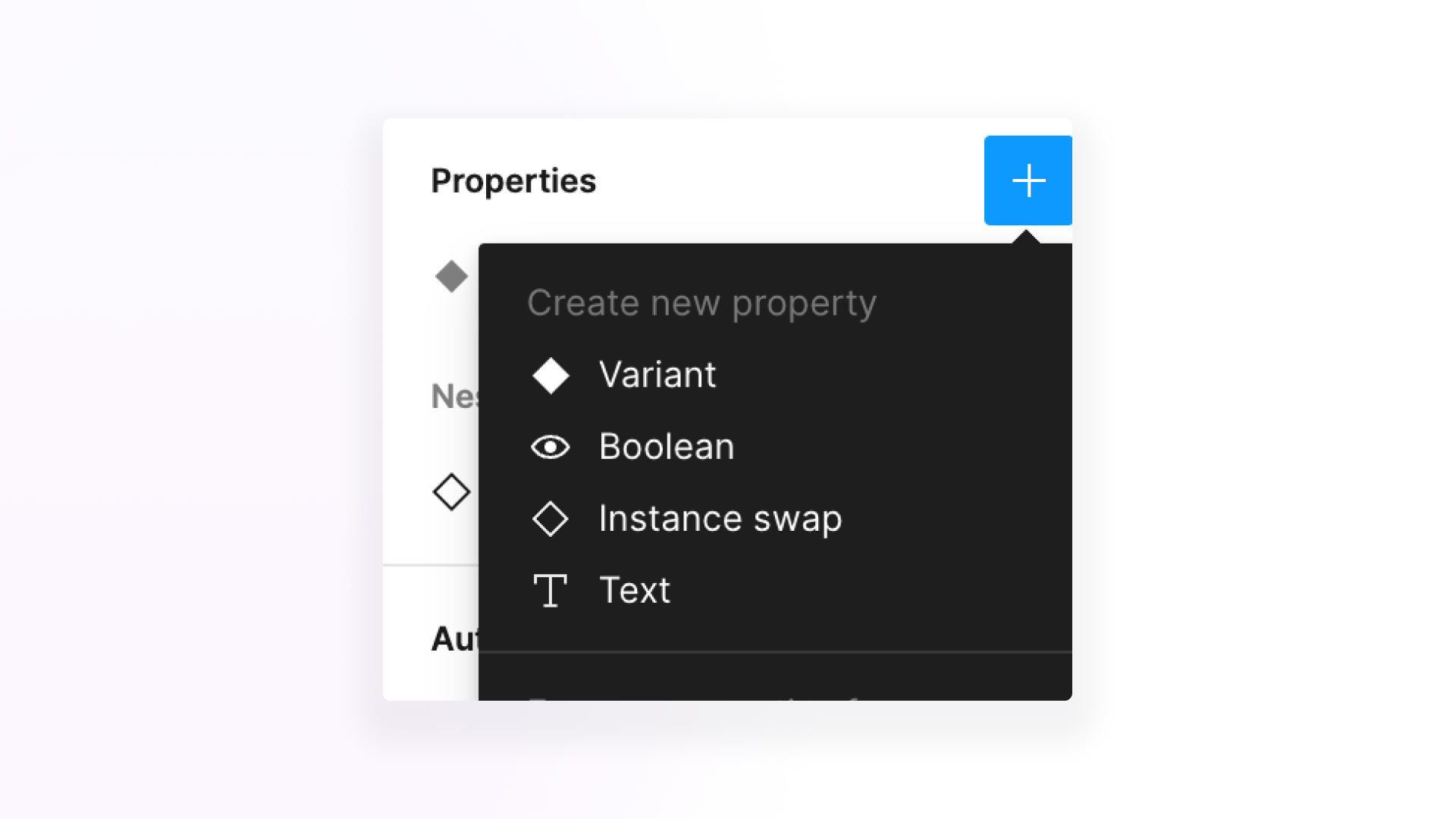
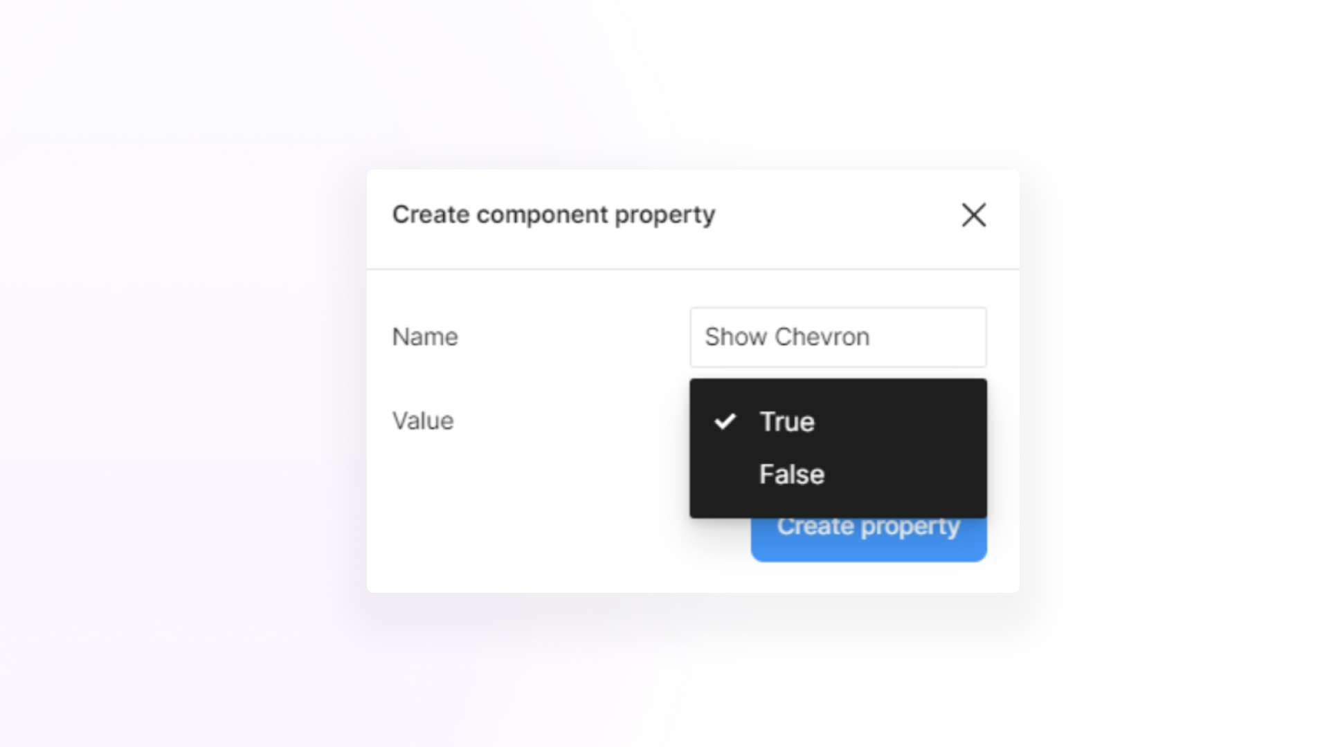
Creating a Boolean Property in Figma is simple:
- Select the item you want to manage with Component Properties.
- Select the component property icon under the Layer section on the right panel in Figma.
- Create your component property by providing the property name and selecting the value. Then click 'Create Property'. For example:
Many designers consider the Boolean property one of Figma's most powerful properties as one of Figma's most powerful property types. This is because it significantly reduces the need to create multiple variants of a single component. Instead of having separate components like "Button - no chevron" and "Button - with chevron," the Boolean property enables you to toggle the chevron's visibility with a simple click.
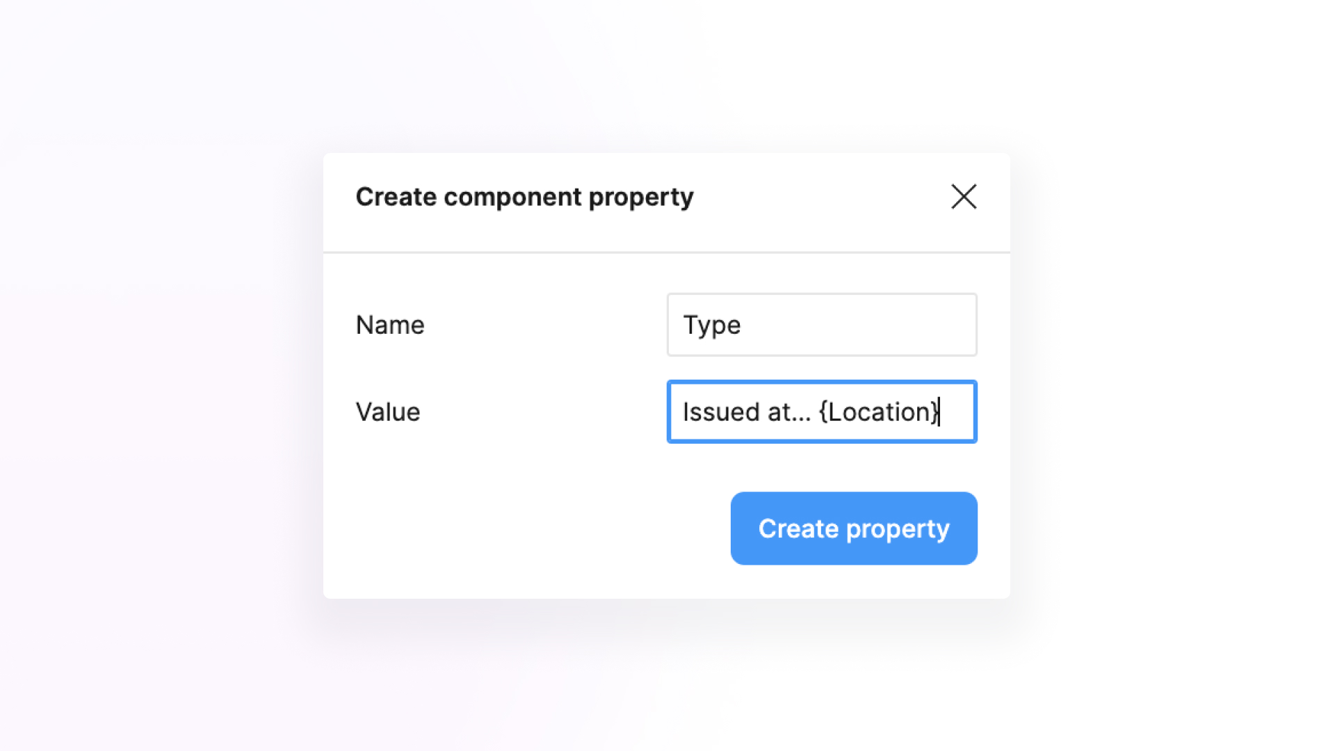
Text property
As the name says, the Text property focuses on the customizable texts in your component. With the Text property, you can conveniently input the text you need directly from the side panel without double-clicking the text element on the component.
To create a Text Property, simply:
- Select the item you want to manage with Component Properties.
- Select the component property icon under the Content section on the right panel in Figma.
- Create your component property by providing the property name and value. Then click Create Property. For example:
Using the Text property for your designs makes for quick and easy customizations, mainly when editing multiple components simultaneously.
For example, if you spot a mistake in the buttons you've placed on your canvas, you wouldn't have to click and edit every button you've set. Simply select all the buttons and edit the text on the property panel on the right. Easy!
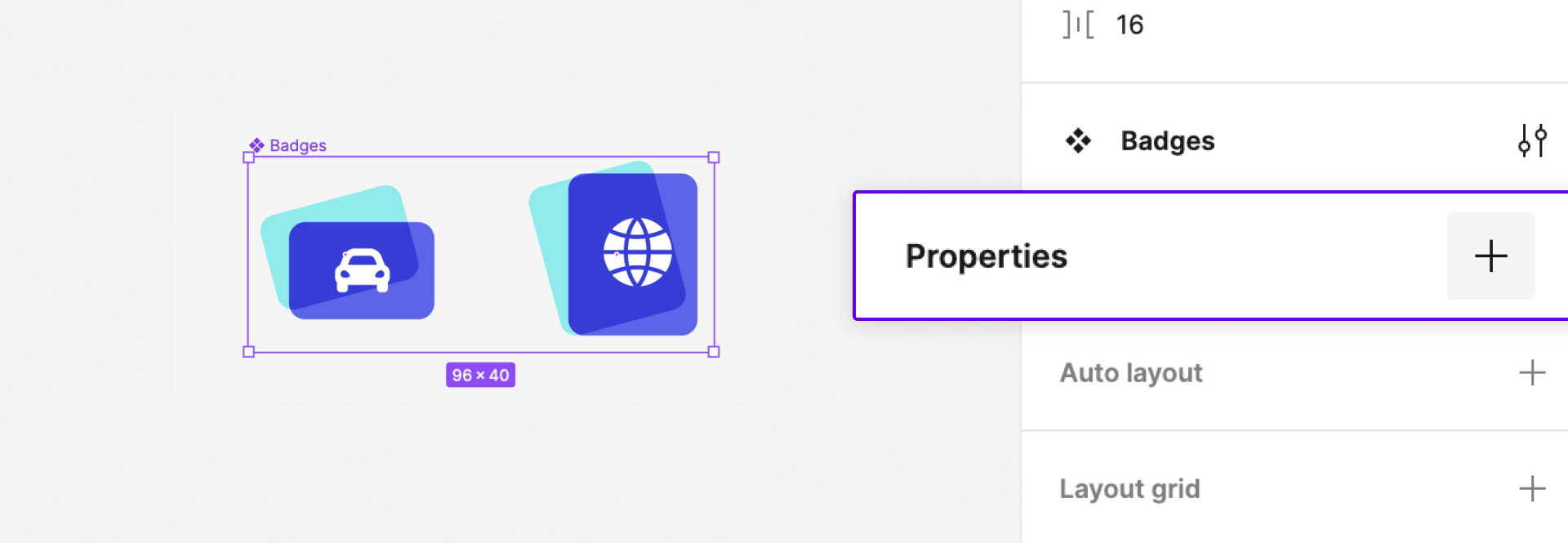
Instance swap property
Swapping instances used to be made up of excessive clicks and multiple component versions. That is until Figma updated Component Properties with the Instance Swap Property. This feature is relatively new but incredibly helpful when designing complex projects.
The Instance Swap Property allows designers to swap instances or variants within your component. You wouldn't have to create multiple versions of your parent component when you use this property!
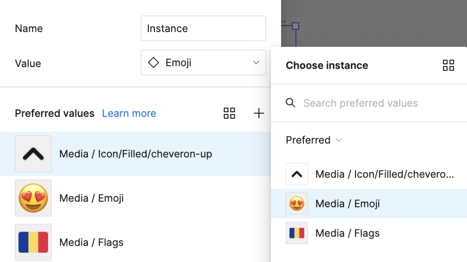
When creating your Instance Swap property, you can choose which preferred values or elements can be swapped with your selected instance. You can choose from existing elements within the same component as your selected instance or your Figma's library.
Figma also allows you to create a collection of Preferred Values in this property.
Preferred values
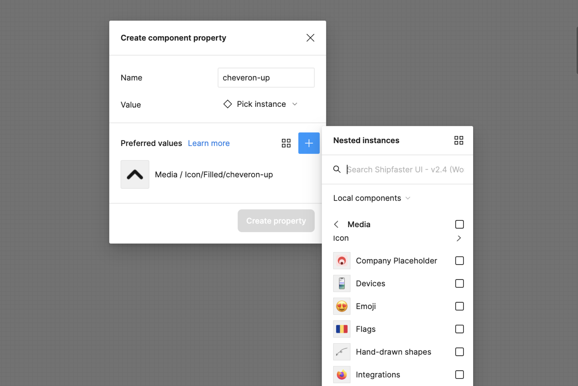
Preferred Values are the collection of assets that a designer can use to swap with selected instances within their designs. They offer a valuable organizational tool, especially when working with multiple components.
If you have a button design where you wish to interchangeably use just ten icons out of 100 available icons in your library, assigning these 1ten0 icons as Preferred Values allows you to easily select from a smaller subset instead of searching through an entire library of 100.
As Figma says, Preferred Values significantly "reduce guesswork by communicating which specific components can replace an existing one."
How to create an Instance Swap Property and Preferred Values
To create an Instance Swap Property, simply:
- Select the component which holds the instance you wish to swap.
- Select the component property icon next to the instance on the right panel in Figma to create an Instance Swap property.
- Provide the property name and select your default instance value.
- Select your Preferred Values for the component.
- Click 'create property.'
To execute the Instance Swap property you created:
- Create a new instance of your parent component.
- Select the new instance of your parent component.
- Find the property name you made for your Instance Swap property and click the drop-down button.
- Select the Preferred Value of the instance you wish to swap.
This powerful feature is handy and helpful in letting you have a more manageable library for your designs - especially complex ones that use many assets. Utilizing Instance Swap Property and organizing Preferred Values is a game-changer.
Variant property
A variant is a component found within a component set. Variants could be components such as buttons, text styles, icons, and more, each with different attributes such as sizes and colors. Within one component set, multiple variants can exist.
To effectively manage and create different versions or states of a component, Figma offers the Variant Property. This property allows you to label and define the attributes of your variants from color to size, providing flexibility and efficiency in your design workflow.
To use the Variant Property:
- Create a component you want variants of, such as buttons, cards, and the like.
- Select the component and select the + icon on the Properties section on the right panel of Figma.
- Select 'Variant'
- Rename the Property type and Variant name under the 'Current Variant' section. You can either name this as Default or Primary Button.
- Select the component you created, and under it, select the + icon to create your first variant.
- Customize the new variant and label the Variant name accordingly under the 'Current Variant' section.
- Repeat steps 5-6 until you've made the number of variants you desire.
- Once you've successfully created variants, open your Components Library [Shift + I] and create an instance of your component.
- Place the component on your canvas and choose which variant you wish to use on the right panel in Figma.
This particular Component Property can be most helpful to designers that create prototypes and are often in projects that require many variations. It provides a convenient way to manage and organize different component states, improving your design process.
What are Nested Instances in component properties?
Nested instances in Figma refer to components placed within other instances of components. In simpler terms, it means having components within components.
For example, you might have a 'Button' component with different variants nested inside a primary component that contains multiple elements like a title, image, logos, and more. In this case, you use an instance of the 'Button' component within the main component.
Before the update on Figma's nested instances, customizing a particular instance within a component required double-clicking the element and hoping that you selected the correct one.
However, with the latest update, the process becomes much more streamlined. Figma's Nested Instances Component Property allows designers to easily select the specific instance they want to customize without digging deep into the main component.
How do I show Nested Instances?
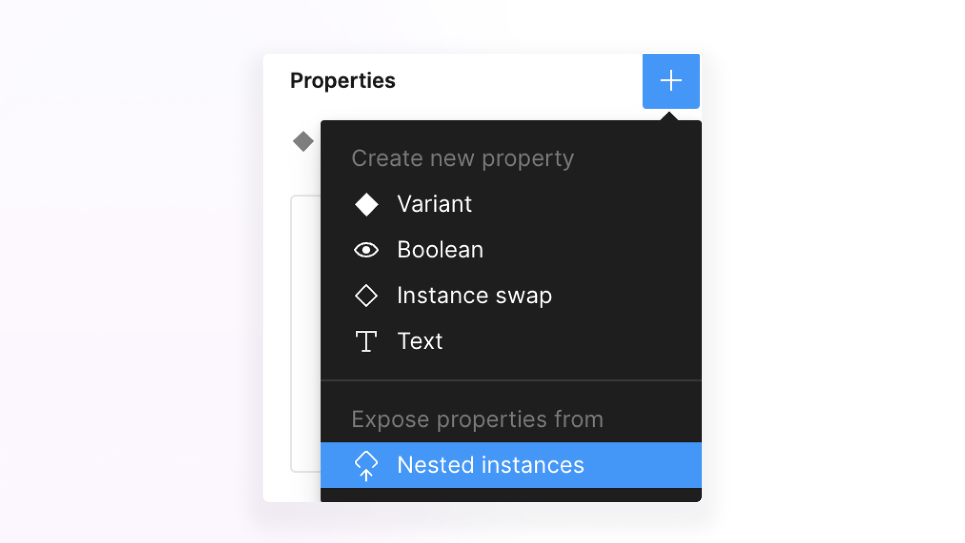
To expose Nested Instances in Figma, here's the step-by-step process:
- Place an instance of a component with numerous components/instances within it with their respective variants.
- On the right panel of Figma, select the + sign next to the 'Properties' section and look for the 'Nested instances' option.
- Select which instance/s you wish to expose.
- Once the instance is exposed, selecting the parent component would reveal the customizable instance without digging into the parent component's instance.
With Figma's Nested Instances, creating combinations of complex components is no longer as daunting as before. Editing the properties of multiple component instances within one component has become easy and efficient for designers like you.
The Component Properties feature in Figma unlocked many possibilities for designers; it makes designing more manageable and helps declutter your workspace by organizing your components.
So skip all the unnecessary clicks, dodge all the space-consuming components, and utilize Component Properties in your designs as early as now!
Struggling with Figma? Join 6,000+ designers and accelerate your career with our Figma Course.
Most UI designers struggle to advance in their careers because they:
- Lack a structured process.
- Struggle to keep up with the demands of a fast-paced working environment.
- Lack specific technical knowledge that's relevant to UI design.
- Unaware of how to hand UI designs over to developers effectively.
- and all the other things that come with being a UI designer.
That is why we have launched the Ultimate Figma & UI Design Masterclass. Our end-to-end 10 hour Figma course that has helped over 6,000 designers from all around the world land a UX design job, double their UX salary and even seal a $10,000 freelance job. The course has helped our students in:
- Building confidence in a real-world, end-to-end UI design process by providing structured, organized, and practical techniques and templates.
- Mastering Autolayout, allowing them to create Responsive Designs with Smart Autolayout Tricks instantly
- Utilizing Figma's advanced features, including interactive components, complex prototypes & animations, design systems, and more
- Applying critical principles in UI design in real-life situations, enabling designers to create visually stunning and user-friendly interfaces.
- Implementing design models and frameworks, including Atomic Design Framework, BEM model, CSS3 Techniques such as Flexbox, Box Model, and more, significantly boosting their confidence in theoretical and technical UI design knowledge.
- Professionally present and collaborate with developers, ensuring a smooth handover.
The best part is that this end-to-end masterclass emphasizes practical, hands-on learning as taught by industry expert Michael Wong. This course also allows designers to enhance their skills and apply newly acquired knowledge in real-life scenarios. Taught in a compelling step-by-step method, this course's engaging content is sure to captivate every eager student's attention.
Don't take our word for it, our students have enough to say.


